Table of Contents
Intro
In this first post of mine, I am going to introduce the audience to open source fantasy football (a facet of football in which running backs DO matter), specifically the concept of TRAP backs.
TRAP stands for Trivial Rush Attempt Percentage, which is a term popularized by Ben Gretch of CBS Sports. TRAP is meant to identify running backs who get the least-valuable touches in fantasy football by measuring a player’s percentage of total touches that are low-value rush attempts outside the 10-yard line.
Loading Data and Packages
The first step in this analysis, as with many of these tutorials, is to load the data that we need. This includes the NFL play-by-play data, team colors and logos data (which will be used later), and NFL player positional data, along with the necessary libraries.
library(tidyverse)
library(dplyr)
library(ggimage)
library(nflfastR)

seasons <- 2019

pbp <- purrr::map_df(seasons, function(x) {
  readRDS(
    url(
      glue::glue("https://raw.githubusercontent.com/guga31bb/nflfastR-data/master/data/play_by_play_{x}.rds")
    )
  )
})

nfl_positions <- read_csv(url("https://raw.githubusercontent.com/samhoppen/NFL_Positions/master/nfl_positions_2011_2019.csv"))
Adding Player Positions
In order to get roster positions into nflfastR (which are not pre-populated), I built a repository that includes all players (from 2011-2019) and their respective position - that’s what the “nfl_positions” data frame is for. Since we’re only looking at running backs for this example, we want to filter out the other positions.
To add these to our pbp data, I used a sequence of left_join functions while adding in some fields that we’ll be using throughout this article. Additionally, because I’m doing this for fantasy football analysis, I want to filter out any non-fantasy-relevant plays, which is what the first filter is doing.
pbp <- pbp %>%
  filter(season_type == "REG", down <= 4, play_type != "no_play") %>%
  left_join(nfl_positions, by = c("passer_id" = "player_id")) %>%
  rename(
    passer_full_name = full_player_name,
    passer_position = position
  ) %>%
  left_join(nfl_positions, by = c("receiver_id" = "player_id")) %>%
  rename(
    receiver_full_name = full_player_name,
    receiver_position = position
  ) %>%
  left_join(nfl_positions, by = c("rusher_id" = "player_id")) %>%
  rename(
    rusher_full_name = full_player_name,
    rusher_position = position
  ) %>%
  select(-c("player.x", "player.y", "player")) %>%
  mutate(
    ten_zone_rush = if_else(yardline_100 <= 10 & rush_attempt == 1, 1, 0),
    ten_zone_pass = if_else(yardline_100 <= 10 & pass_attempt == 1 & sack == 0, 1, 0),
    ten_zone_rec = if_else(yardline_100 <= 10 & complete_pass == 1, 1, 0),
    field_touch = case_when(
      yardline_100 <= 100 & yardline_100 >= 81 & (rush_attempt == 1 | complete_pass == 1) ~ "touch_100_81",
      yardline_100 <= 80 & yardline_100 >= 61 & (rush_attempt == 1 | complete_pass == 1) ~ "touch_80_61",
      yardline_100 <= 60 & yardline_100 >= 41 & (rush_attempt == 1 | complete_pass == 1) ~ "touch_60_41",
      yardline_100 <= 40 & yardline_100 >= 21 & (rush_attempt == 1 | complete_pass == 1) ~ "touch_40_21",
      yardline_100 <= 20 & yardline_100 >= 0 & (rush_attempt == 1 | complete_pass == 1) ~ "touch_20_1",
      TRUE ~ "other"
    )
  )
Visualizing TB Touch Percent Based on Distance from the End Zone
Now that our play-by-play data has all of the information we need, we’re ready to start building new dataframes for our analysis.
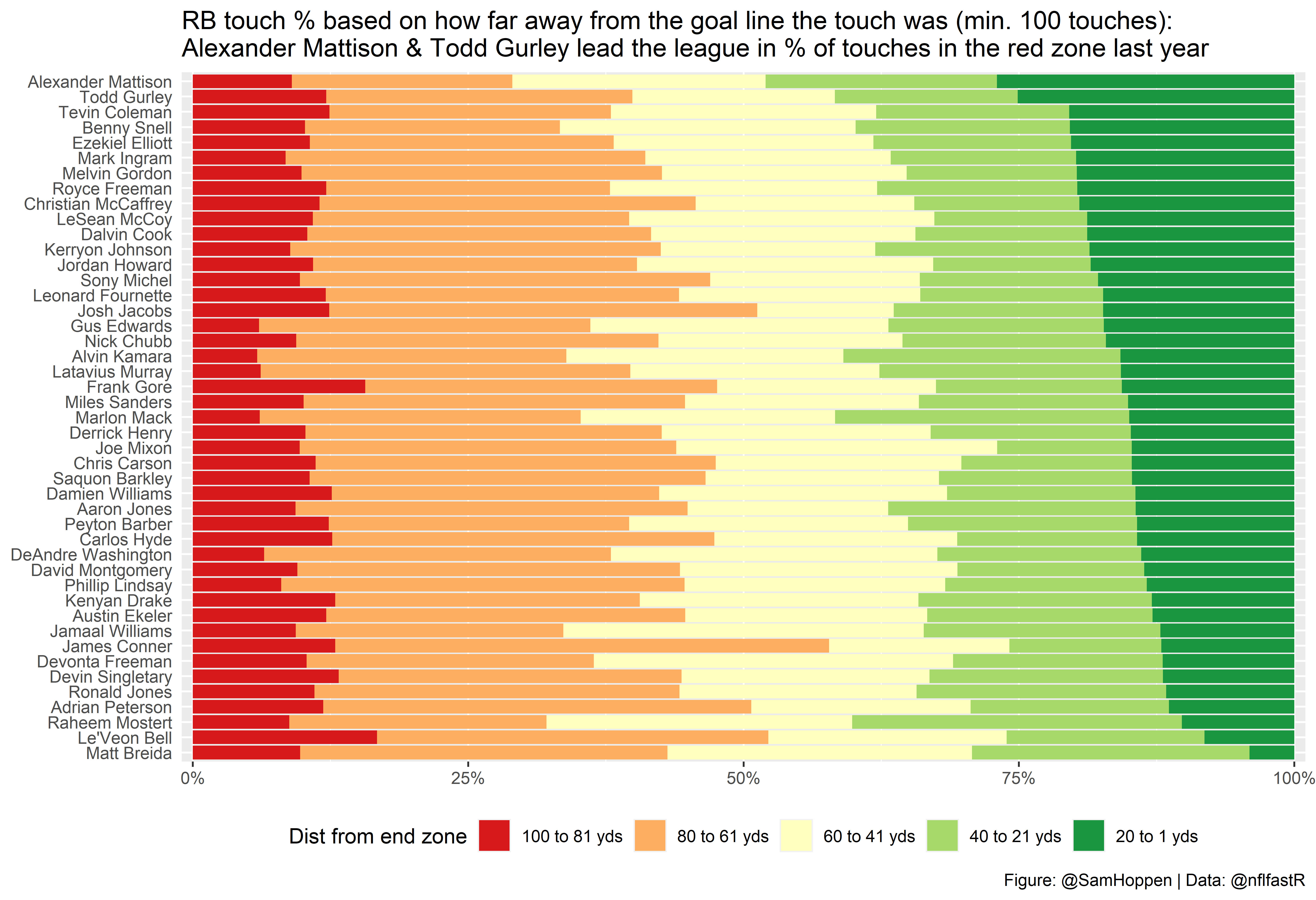
The first piece of analysis is looking at the area of the field in which a running back’s rush attempts comes. This helps us get a high-level view of which running backs are getting touches closer to the goal line, which are the most valuable for fantasy football.
In this next block of code, we have a couple of things going on. First, as mentioned earlier, we’re filtering out only the running backs and grouping them in a way to get the total count of rushes for each area of the field, as defined above. Additionally, I’ve added an extra column in the second block of code to calculate the percent of rushes in each area of the field.
rb_touches <- pbp %>%
  filter(rusher_position == "RB") %>%
  group_by(
    rusher_full_name,
    rusher_player_id,
    field_touch
  ) %>%
  summarize(touches = n())

rb_touches <- rb_touches %>%
  group_by(rusher_full_name, rusher_player_id) %>%
  mutate(
    total_touches = sum(touches),
    pct_touches = touches / total_touches
  ) %>%
  filter(total_touches >= 100)
Now we have all of the data we need to build our first chart, but there are still a couple of small modifications to make in order to have our chart appear the way that we want it to.
First, is creating a second dataframe that we’ll use to append to our primary dataframe - all I’m doing is pulling out each players’ red zone rush percent. I’m doing this because I eventually want to sort my chart by players’ red zone rushes as a percent of total touches, from highest to lowest. This may not be the most efficient way to add this data column, but it gets the job done.
rb_touches_2 <- rb_touches %>%
  filter(field_touch == "touch_20_1") %>%
  select(rusher_full_name, rusher_player_id, pct_touches)

rb_touches <- left_join(rb_touches,
  rb_touches_2,
  by = c(
    "rusher_full_name" = "rusher_full_name",
    "rusher_player_id" = "rusher_player_id"
  )
)
Second is a step I’m taking to use some custom colors from the Rcolorbrewer package, which will help us better visualize which running backs are getting the highest value touches (i.e. carries closer to the end zone). What I’m doing here is transforming our “field_touch” variable to a factor. We do this so that we can order the values in a way that aligns with the coloring we want, which is what we do in the second block of code below.
library(RColorBrewer)
rb_touches$field_touch <- as.factor(rb_touches$field_touch)
rb_touches$field_touch <- factor(rb_touches$field_touch, levels = c("touch_20_1", "touch_40_21", "touch_60_41", "touch_80_61", "touch_100_81"))

colors <- brewer.pal(name = "RdYlGn", n = nlevels(rb_touches$field_touch))
names(colors) <- rev(levels(rb_touches$field_touch))
Now that we have the data in the format that we want we’re ready to build our graph (using ggplot2, of course)!
ggplot() +
  geom_col(
    data = rb_touches,
    aes(x = pct_touches.x, y = reorder(rusher_full_name, pct_touches.y), fill = field_touch)
  ) +
  scale_fill_manual(
    values = colors,
    limits = c("touch_100_81", "touch_80_61", "touch_60_41", "touch_40_21", "touch_20_1"), labels = c("100 to 81 yds", "80 to 61 yds", "60 to 41 yds", "40 to 21 yds", "20 to 1 yds")
  ) +
  labs(
    x = "Percent of plays",
    fill = "Dist from end zone",
    title = "RB touch % based on how far away from the goal line the touch was (min. 100 touches):\nAlexander Mattison & Todd Gurley lead the league in % of touches in the red zone last year",
    caption = "Figure: @SamHoppen | Data: @nflfastR"
  ) +
  scale_x_continuous(
    labels = scales::percent_format(accuracy = 1),
    expand = c(0, 0.01)
  ) +
  theme(
    axis.title.y = element_blank(),
    axis.ticks.y = element_blank(),
    axis.title.x = element_blank(),
    legend.position = "bottom"
  )
Visualizing High-Value Touches and the TRAP Model
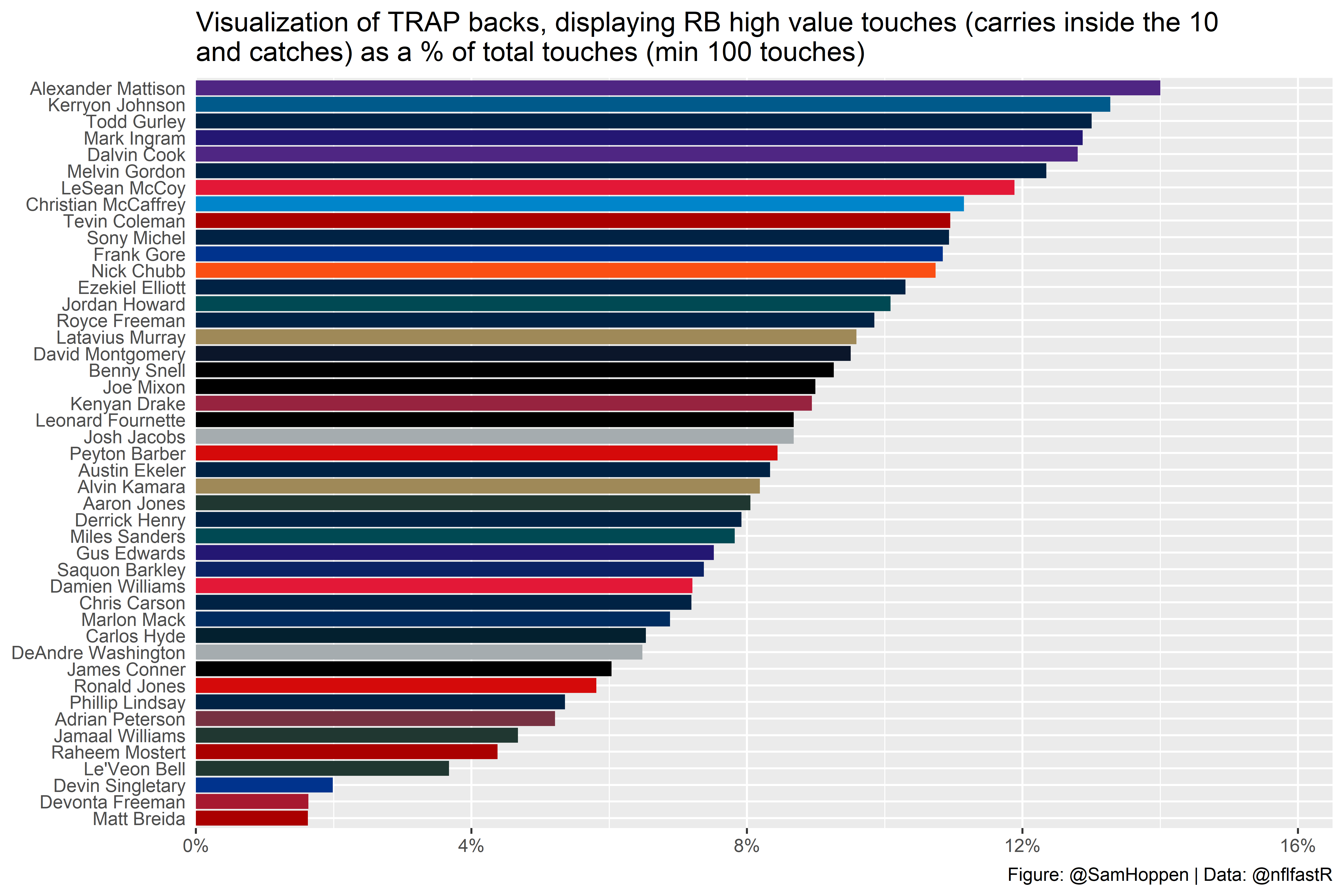
This isn’t all that we can do, though. Taking the next step, we focus on one of the tenets of the TRAP model: high-value touches (HVT). A high-value touch is defined as a rush attempt inside the 10 yard line or a reception anywhere on the field. To calculate a running back’s TRAP, we take the percent of a player’s non-HVTs as a percent of his total touches.
So, how do we do this? Well, using some of the fields that we’ve already added to the play-by-play data!
We’re going to start by making some new dataframes, though, so as not to get stuff mixed up. You’ll also notice that I removed Kenyan Drake’s time with the Dolphins so we can get a representation of his role with Arizona (and it makes the data a little messy).
rb_hvt <- pbp %>%
  filter(rusher_position == "RB") %>%
  group_by(
    rusher_full_name,
    rusher_player_id,
    posteam
  ) %>%
  summarize(
    rush_attempts = sum(rush_attempt),
    ten_zone_rushes = sum(ten_zone_rush),
    receptions = sum(complete_pass),
    total_touches = rush_attempts + receptions,
    hvts = receptions + ten_zone_rushes,
    non_hvts = total_touches - hvts,
    hvt_pct = hvts / total_touches,
    non_hvt_pct = non_hvts / total_touches
  )

rb_hvt <- rb_hvt[!(rb_hvt$rusher_full_name == "Kenyan Drake" & rb_hvt$posteam == "MIA"), ]
Since the data isn’t ready-made in the correct format needed for the ggplot that we’ll be building, there are a couple minor modifications to do. The first of these is using pivot_longer to get our values matched up in the right way. Additionally, I’ve created a lookup dataframe. This is done in order to add an extra field to sort our ggplot from high to low, as we did earlier.
rb_hvt <- rb_hvt %>%
  pivot_longer(cols = c(hvt_pct, non_hvt_pct), names_to = "hvt_type", values_to = "touch_pct")

hvt_lookup <- rb_hvt %>%
  filter(hvt_type == "hvt_pct") %>%
  select(rusher_full_name, rusher_player_id, hvt_type, touch_pct)

rb_hvt <- left_join(rb_hvt,
  hvt_lookup,
  by = c(
    "rusher_full_name" = "rusher_full_name",
    "rusher_player_id" = "rusher_player_id"
  )
)
Here, we also add the teams_colors_logos dataframe (which we loaded up earlier) as we’ll be using that as part of our visualization in the plot.
rb_hvt <- left_join(rb_hvt,
  teams_colors_logos,
  by = c("posteam" = "team_abbr")
) %>%
  filter(total_touches >= 100, hvt_type.x == "hvt_pct")
Now we’ve got our data ready for visualization and are good to plot!
ggplot() +
  geom_col(
    data = rb_hvt,
    aes(x = touch_pct.x, y = reorder(rusher_full_name, touch_pct.x)), fill = rb_hvt$team_color
  ) +
  geom_text() +
  labs(
    x = "Percent of plays",
    fill = "Distance from goal line",
    title = "Visualization of TRAP backs, displaying RB high value touches (carries inside the 10\nand catches) as a % of total touches (min 100 touches)",
    caption = "Figure: @SamHoppen | Data: @nflfastR"
  ) +
  scale_x_continuous(
    labels = scales::percent_format(accuracy = 1),
    limits = c(0, 0.165),
    expand = c(0, 0)
  ) +
  theme(
    axis.title.y = element_blank(),
    axis.ticks.y = element_blank(),
    axis.title.x = element_blank()
  )
Voila, that’s your intro to open source (fantasy) football! Hope you all enjoyed!